Redecorating Our Downstairs Toilet
Thought I’d kick things off with my first home/interior blog post talking about one of the most used rooms in the house… The downstairs toilet.
I think for lots of people, the downstairs toilet is normally a pretty small, pretty sad, often ignored room. But I also think it’s the one where you can have the most fun with decorating. As it’s normally a small room, and often without a window or with a very small window, a lot of people think painting it white is the best idea. But, with small rooms that are dark anyway, there’s no point trying to make it look bigger by painting it white, because it’s just going to look dull and cold.
The best thing to do is embrace it, and paint it dark, or paint it a crazy colour, or wallpaper the whole thing in something fun like leopard print (or zebra print if you’re me). This is the space that you can have some fun, it’s the space most of your guests will use and so it’s the space that get the most comments too. Are your guests really going to compliment the shade of white you used in the downstairs loo? Or are they going to compliment your brave colour choices, your funky wallpaper, your cool tiles etc. So, what I’m trying to say is, throw caution to the wind, have a bit of fun in there and explore your interior style at the same time.
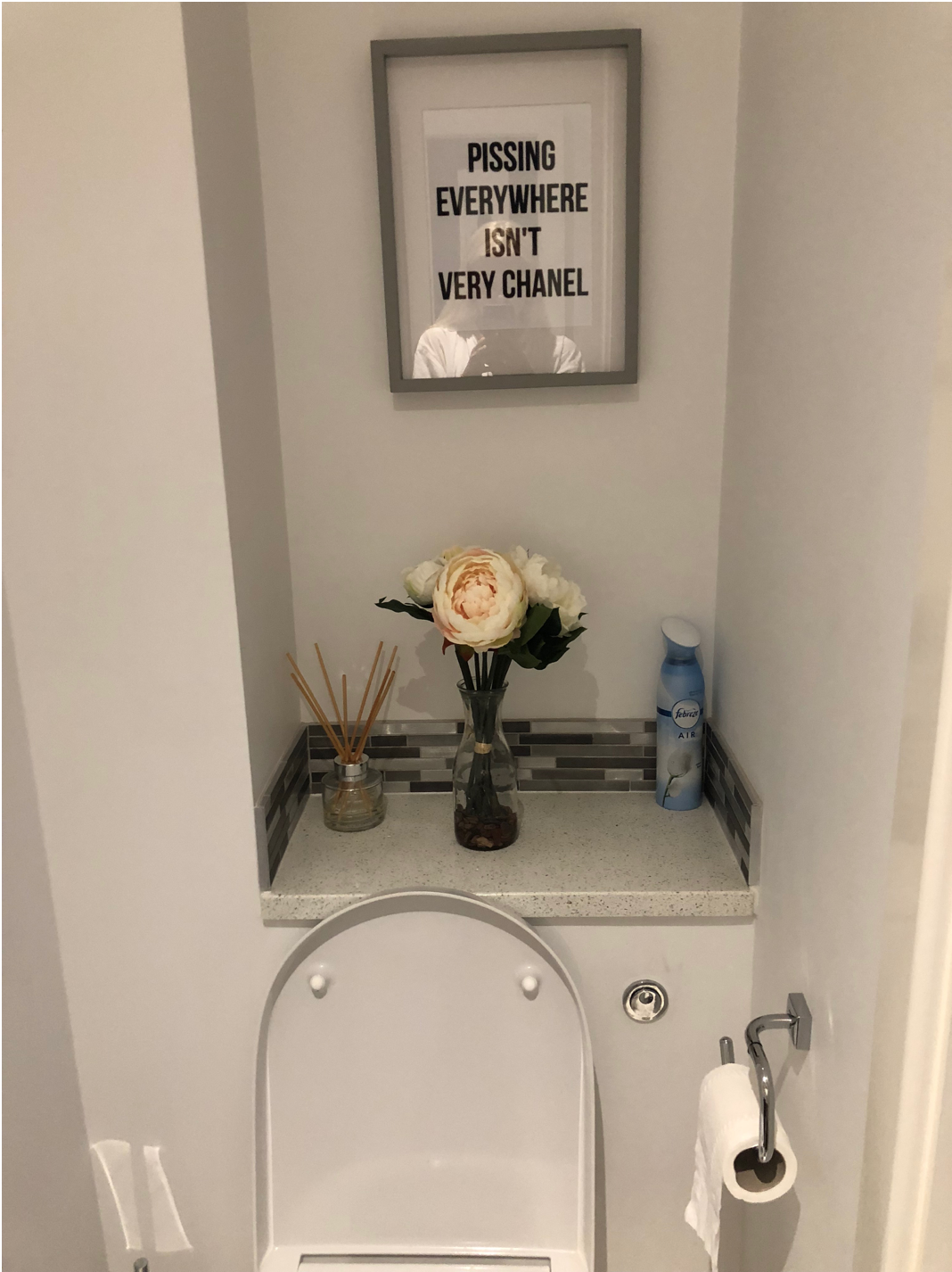
So, here’s some pictures of my downstairs toilet before (excuse the dodgy photos, I wasn't actually planning on sharing these anywhere!).
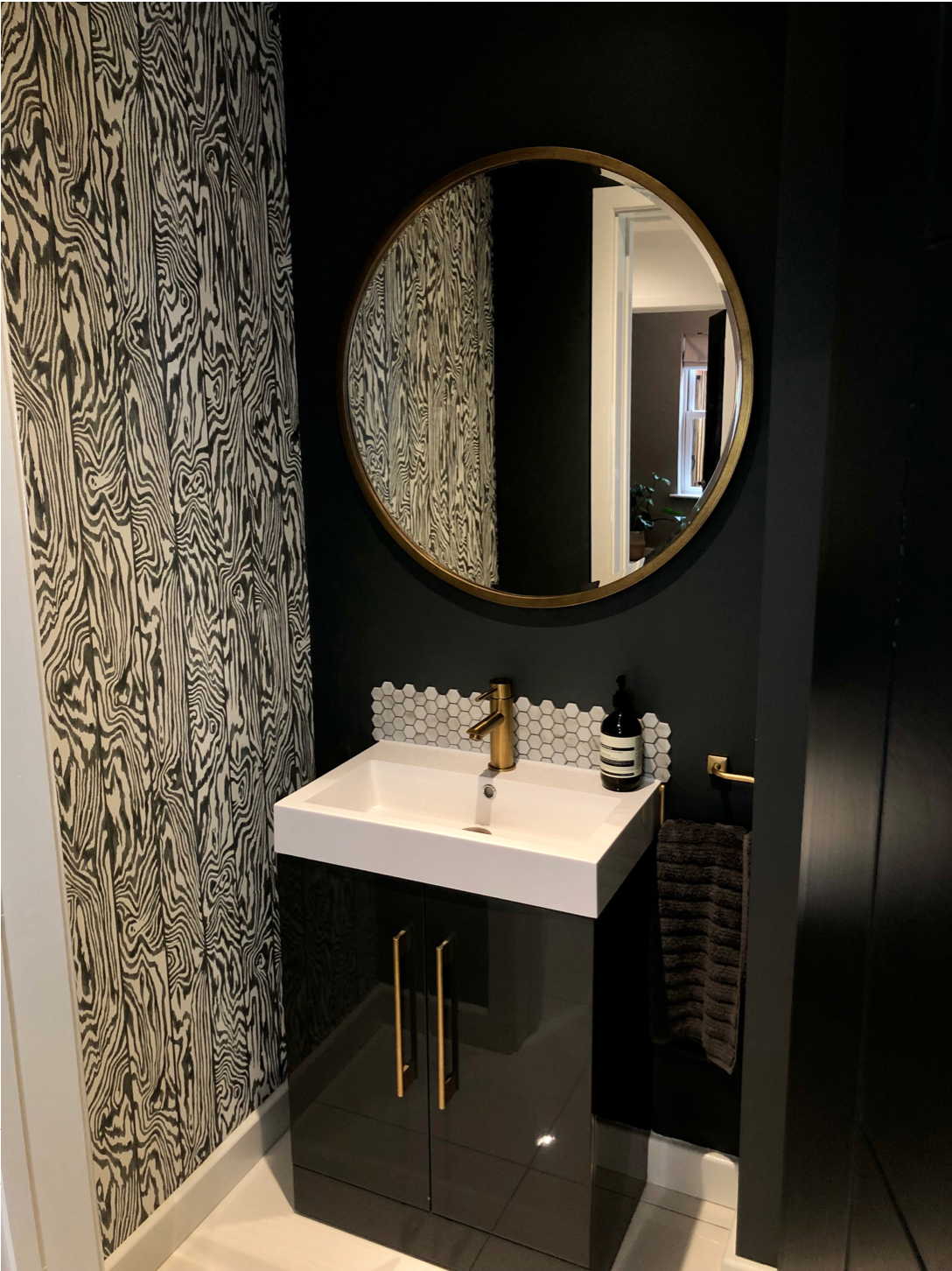
And here’s the pictures of it after decorating:
I decided to go really dark in my downstairs loo, and painted it in Farrow and Ball ‘Downpipe’. I then saw some amaazing zebra wallpaper on Anthropologie, which I just felt would go so well with the colour. One of the things I do first to check that everything works with the theme of the room is to create a moodboard on powerpoint or keynote to see if everything goes together. I also went down to Tile Flair which is local to me, and picked out some small marble hexagon tiles - I loved the hexagon shape and the white went nicely against the darker wall, and the marble colouring tied in the zebra wallpaper with the greys and whites. From here I added in brass coloured accessories, such as the tap which is from Lusso Stone, and then I sprayed the cabinet door handles and the towel rail with metal gold spray paint from Homebase.
Then, on to my favourite part… the accessories! I bought lots of glass and brass hanging photo frames from Oliver Bonas, and created a bit of a gallery wall. I love photos in a downstairs loo, not sure if this is weird but when I’m sat in the toilet in someone else’s house, I love having a nosy at the family photos they have in there!
The mirror is from Perch and Parrow, and fitted perfectly into the space. A big mirror will also help make the space look bigger.
SHOP THE LOOK
Paint: Farrow and Ball Downpipe
Tap and Plug: Lusso Stone
Frames: Oliver Bonas
Mirror: Perch and Parrow
Soap: Aesop
I hope you enjoyed this post and hopefully it has inspired you to give your downstairs toilet a makeover!


